
Find care, with Carebee
Carebee is an online caregiving service that connects and matches caregivers to care users in need. Their mission is to create a marketplace for personalized, timely and quality care within communities.
My Role
Project Management, Creative Direction & Design
Main Goal
Establish a brand identity and graphic system that’s synonymous with the service.
Make your mark
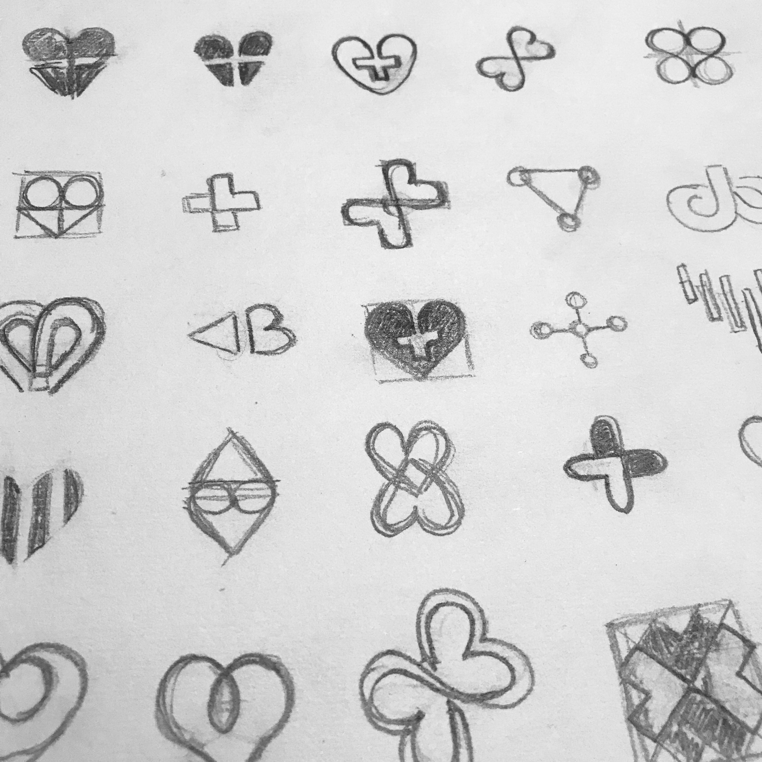
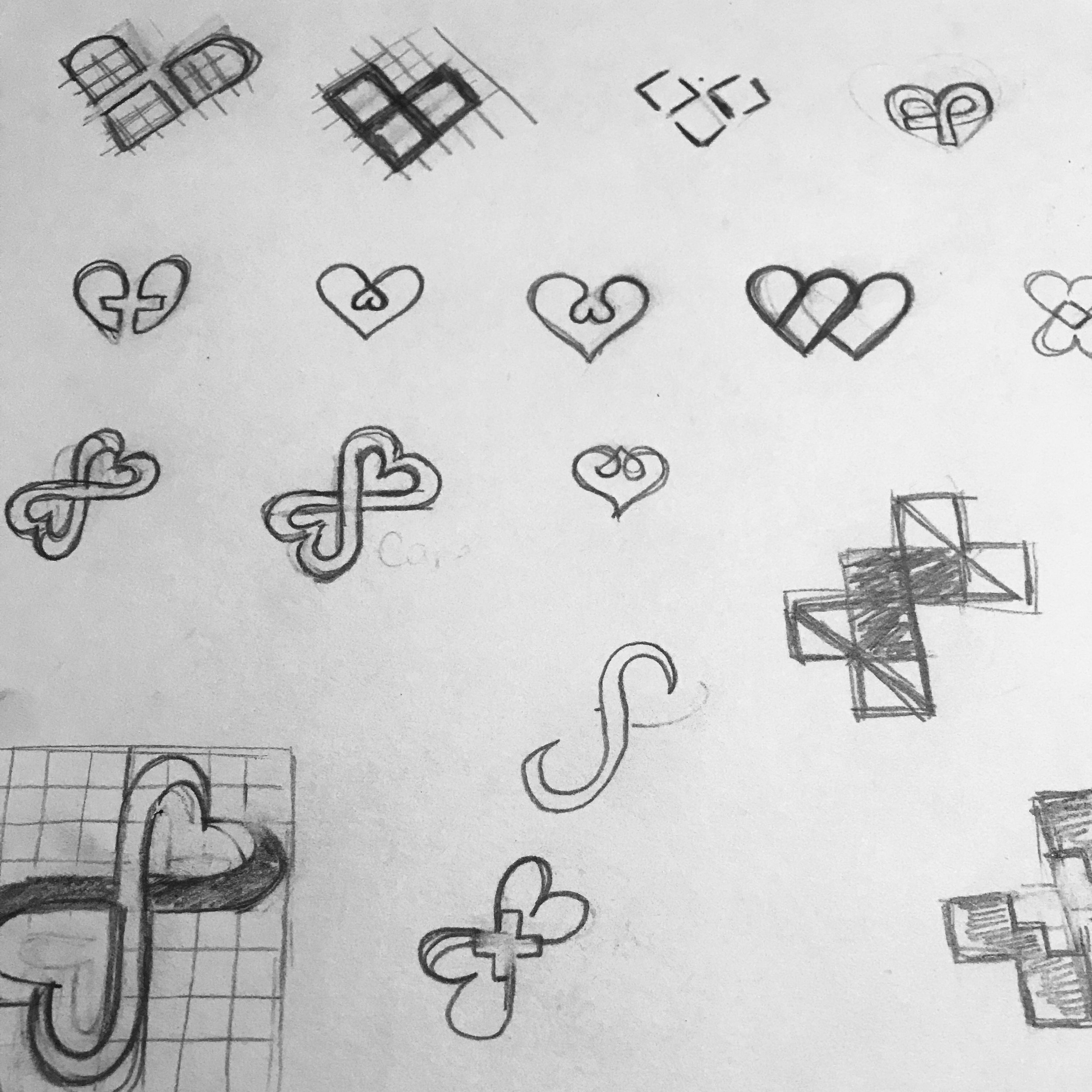
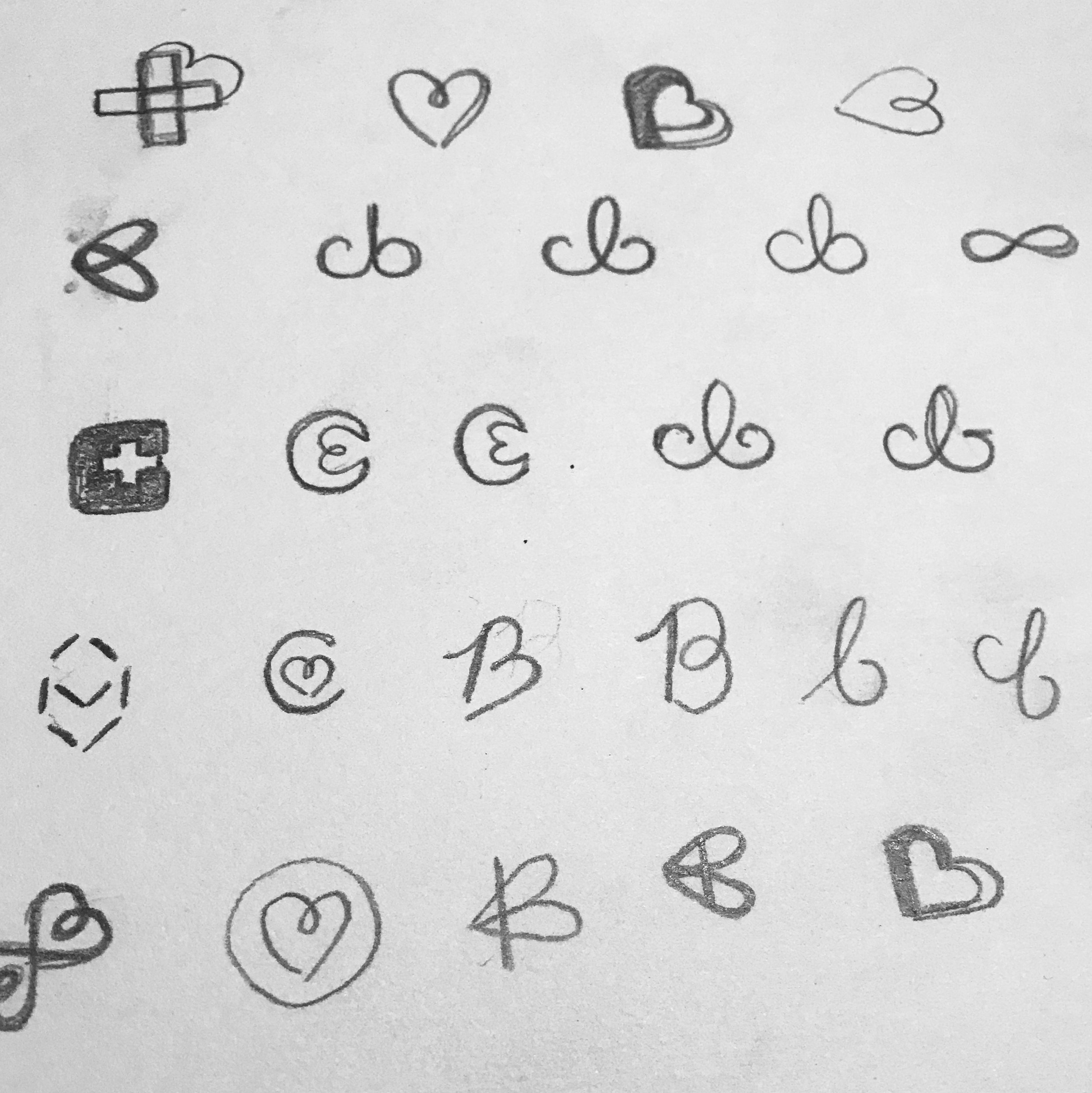
The Carebee brand is all about the connections we make; connecting caregivers to care users, establishing relationships with one another, and most importantly, contributing to something much greater than ourselves in the process. Thus, it was only natural to emphasize this connection in the logo mark.
Stay golden
Similar to the Golden Ratio, the logo is based on a 1.5” grid and radius of curvature, reciprocals, and multiples thereof. Basically, it’s a just a fancy grid to achieve balance and proportion in your design.

Labour of love
Playing off the brand name and it’s affiliation to worker bees, I really wanted the graphic identity to emphasize the love and labour that goes into being a caregiver. Much like caregivers, worker bees dedicate the majority of their time to nurturing and maintaining their colony.

Brand System
Once the logo mark had been established, it was time to consider brand application and develop a graphic system. This included a colour palette, typography, header styles, business collateral, photography and digital elements.


