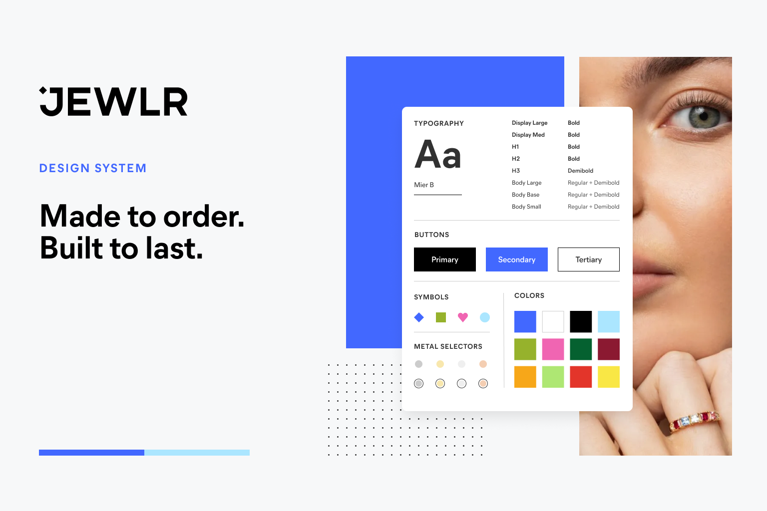
Jewlr Design System
My Role
Senior UX/UI Designer. I was responsible for creating, prototyping, and testing all of the components, page designs and key user journeys.
Main Goal
Build a scalable design system that reflects Jewlr’s updated brand identity.
Jewlr is a jewelry e-commerce site where users can create personalized pieces that are as meaningful to give as it is to wear. Customers can personalize every aspect of a product—from the metal, to the number and type of stones, and more—to create a piece that is uniquely yours. The goal wasn't simply to create a new library of components, but establish a shared design language and scalable way of working that would help designers and developers create consistent experiences faster.
Knowing Your User
A design system cannot be created by design alone.
In order to have a truly successful design system, designers and engineers need to have a close working relationship. Together, they can establish a shared product foundation that accommodates the needs of both parties. Designers need reusable UI patterns to design and iterate faster. Developers require reusable code to ship products quicker. By building it together, we ensure both teams will leverage and adopt the system.

Breaking Down the Process
The process consisted of four phases:
Discover → Define → Build → Validate
01 | Discover
Before designing anything, I reviewed the brand playbook provided by the agency that details Jewlr’s new strategic vision and visual look and feel. This includes their recommendation on how to apply the brand story to web, digital and social channels. I also analyzed existing Figma files and audited the site across key user journeys, taking note of recurring UI patterns.
The audit revealed multiple spacing conventions, various card patterns and inconsistent typography styles in the web application chapter of the brand playbook.
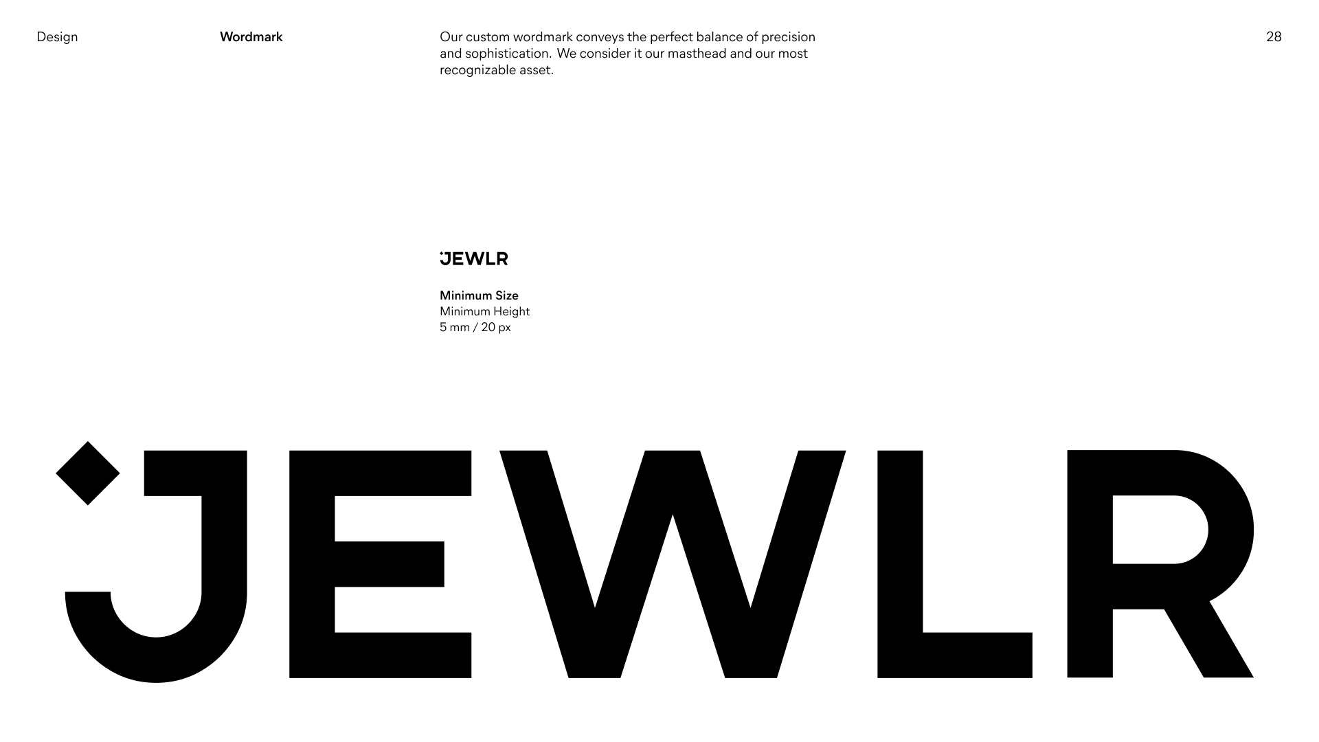

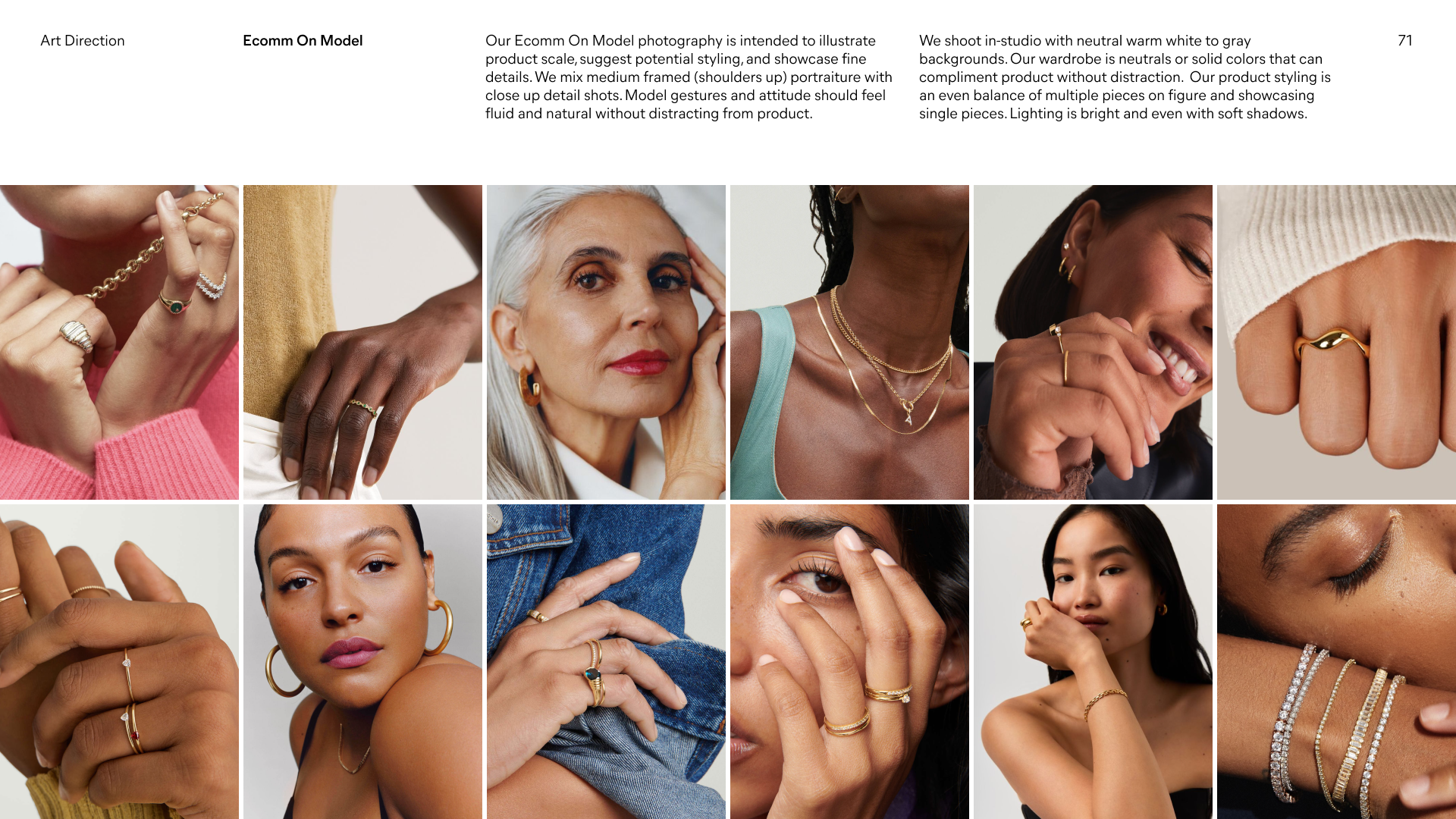
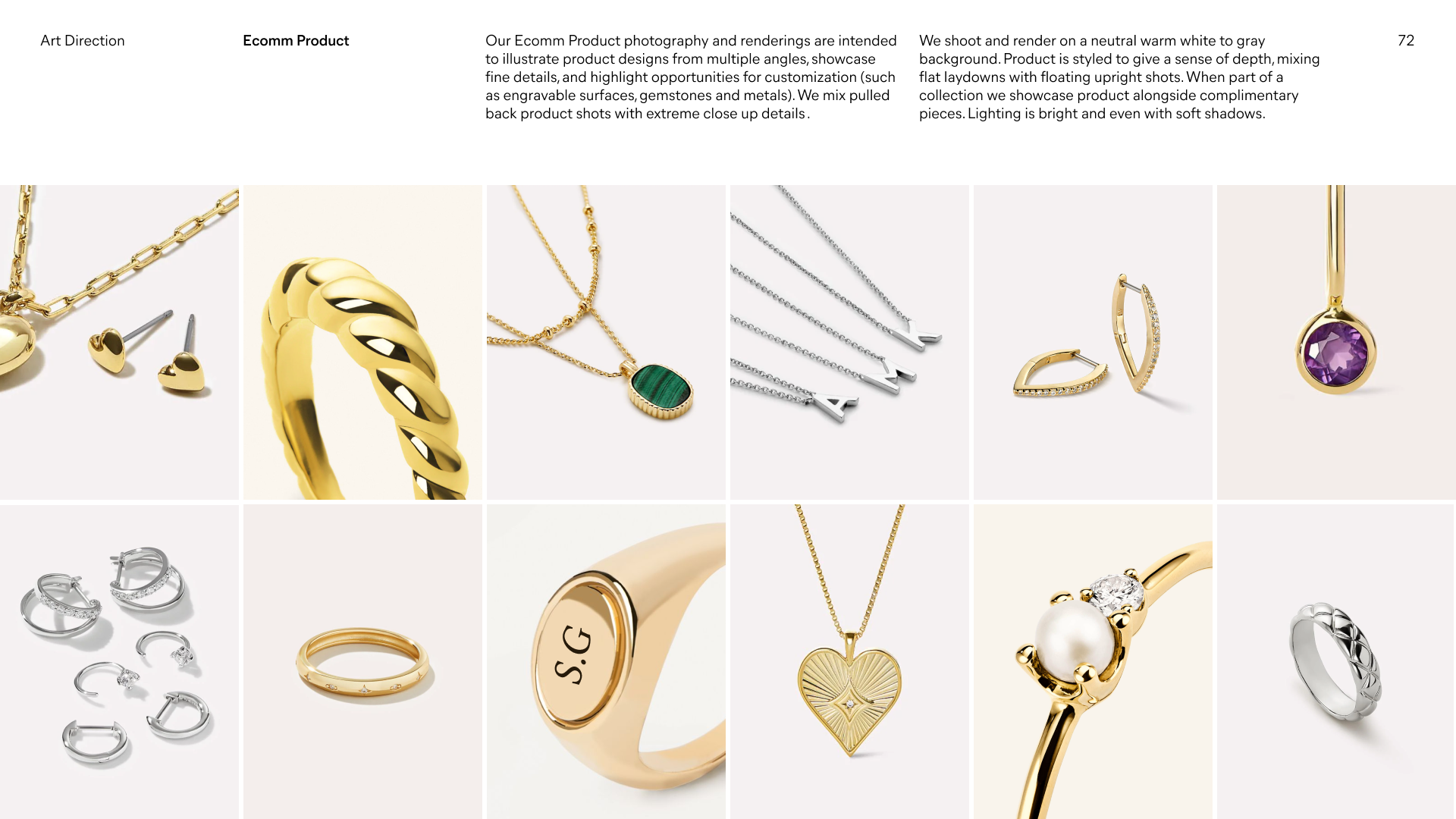
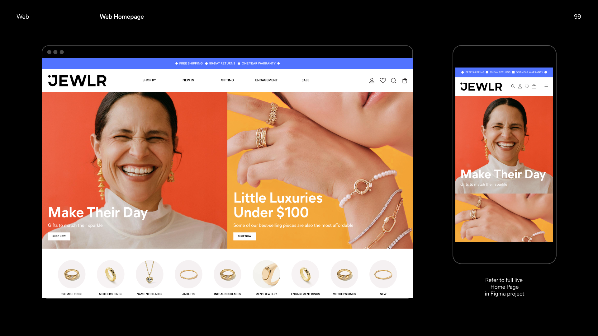
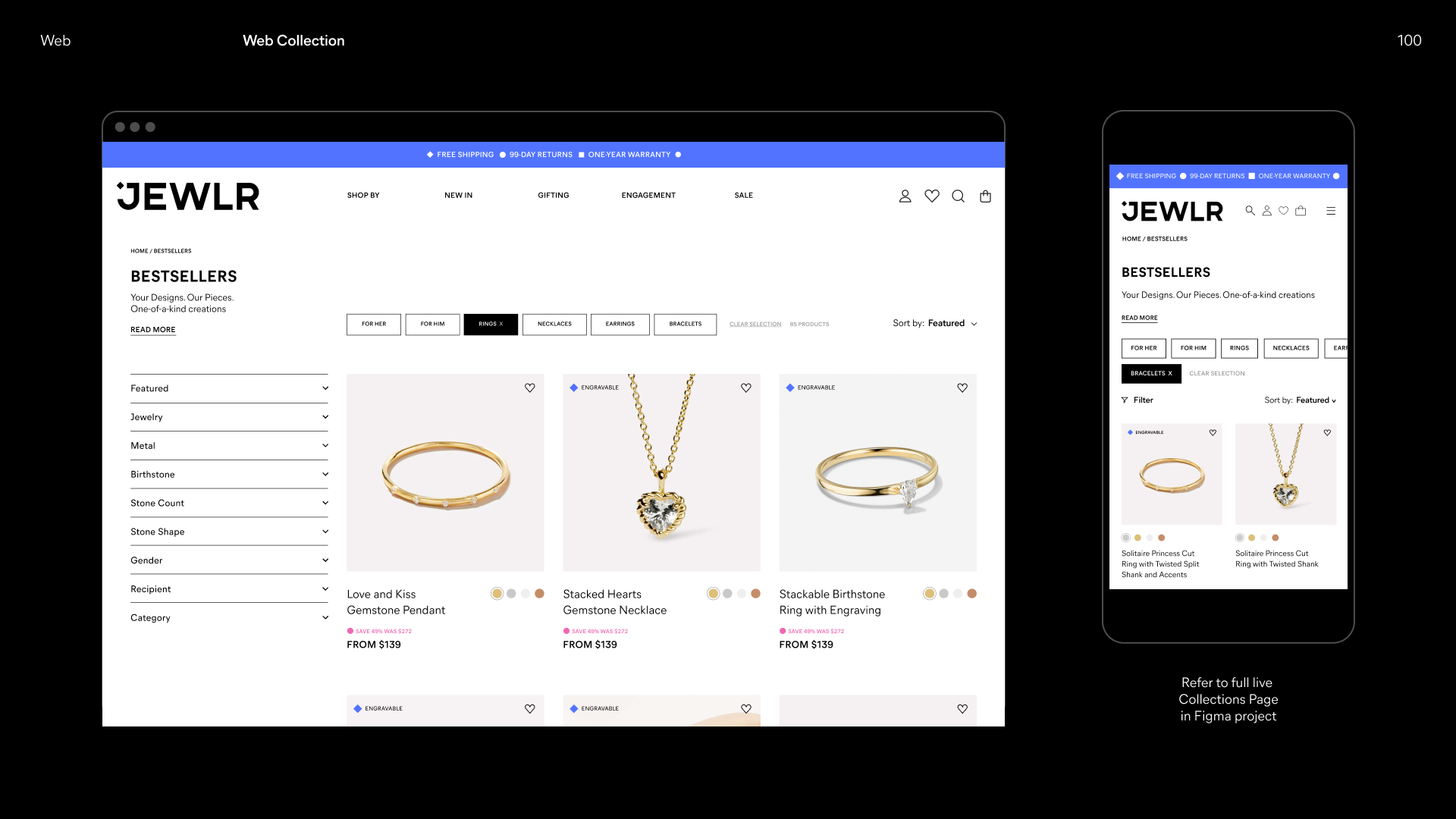
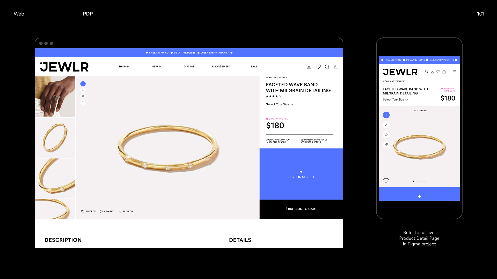
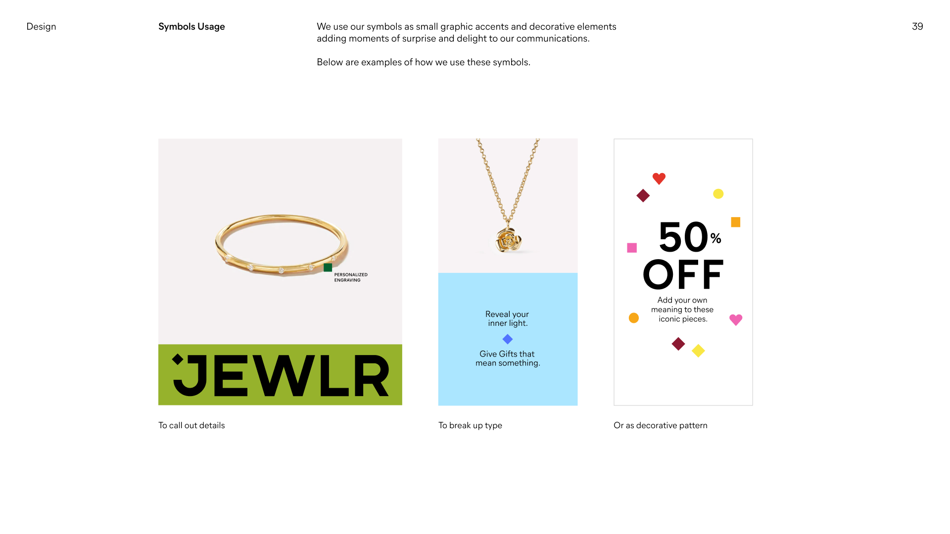
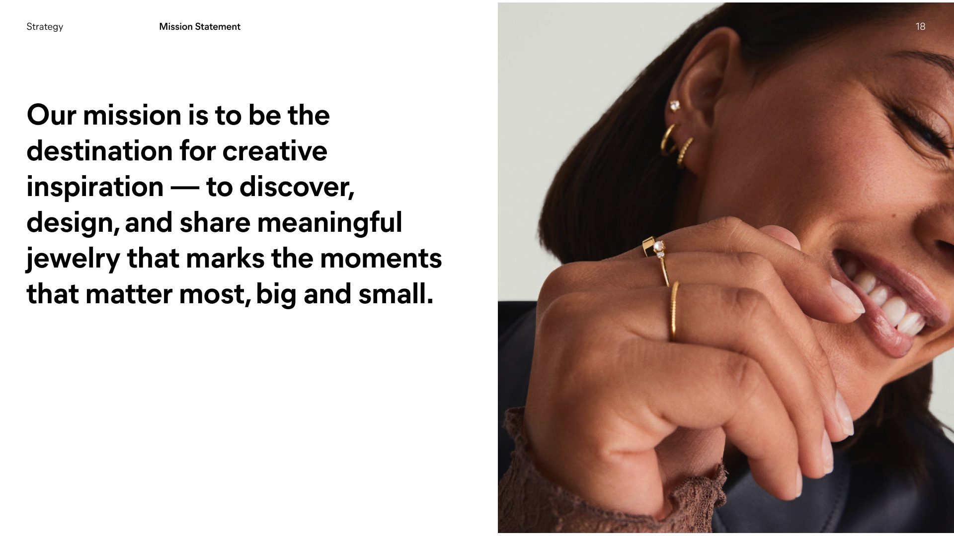
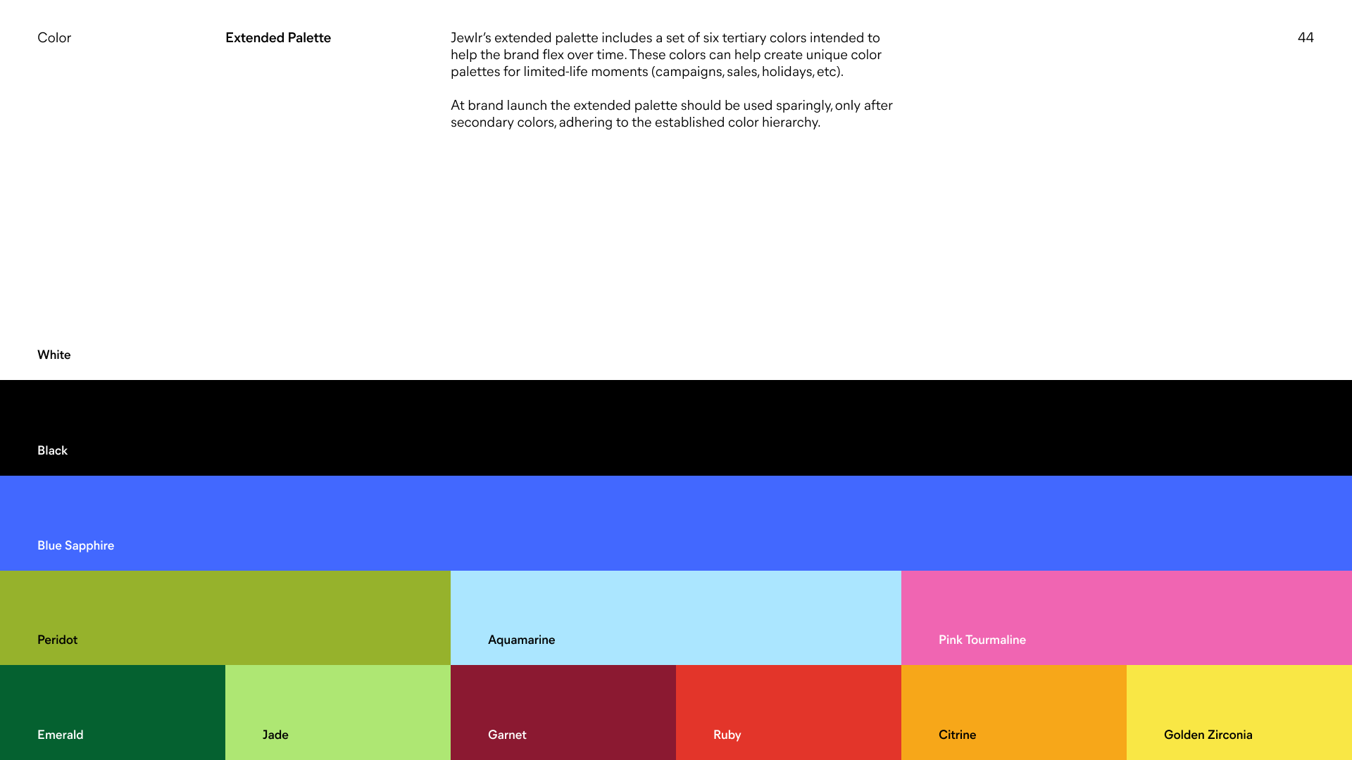
Jewlr Brand Playbook by Aruliden
02 | Define
Once the audit was complete, I worked with the UX design manager and engineering team to establish the foundations of the system. We defined the colours, typography, spacing, breakpoints, grid and layout rules, to name a few. We needed to establish how we wanted to apply the brand look and feel to digital, ensuring that all components were accessible and AODA compliant.
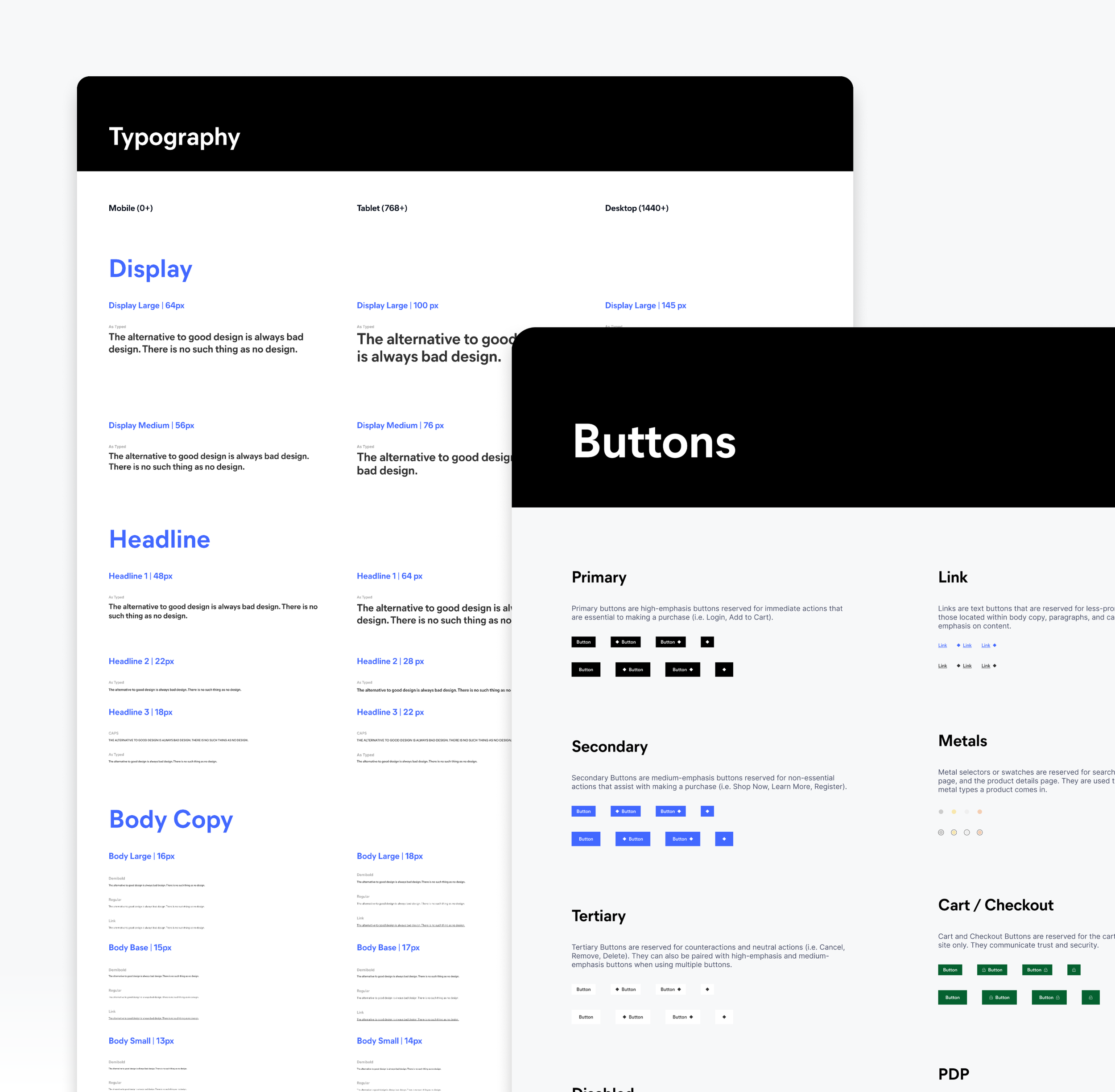
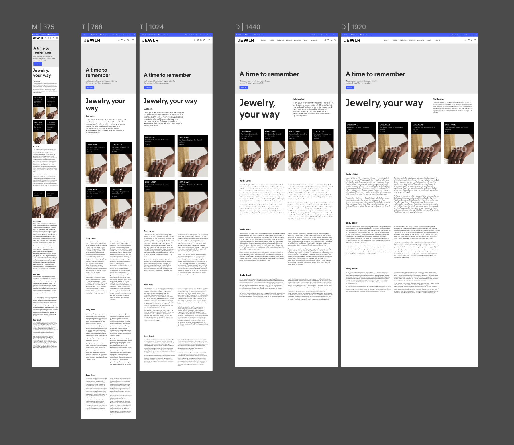
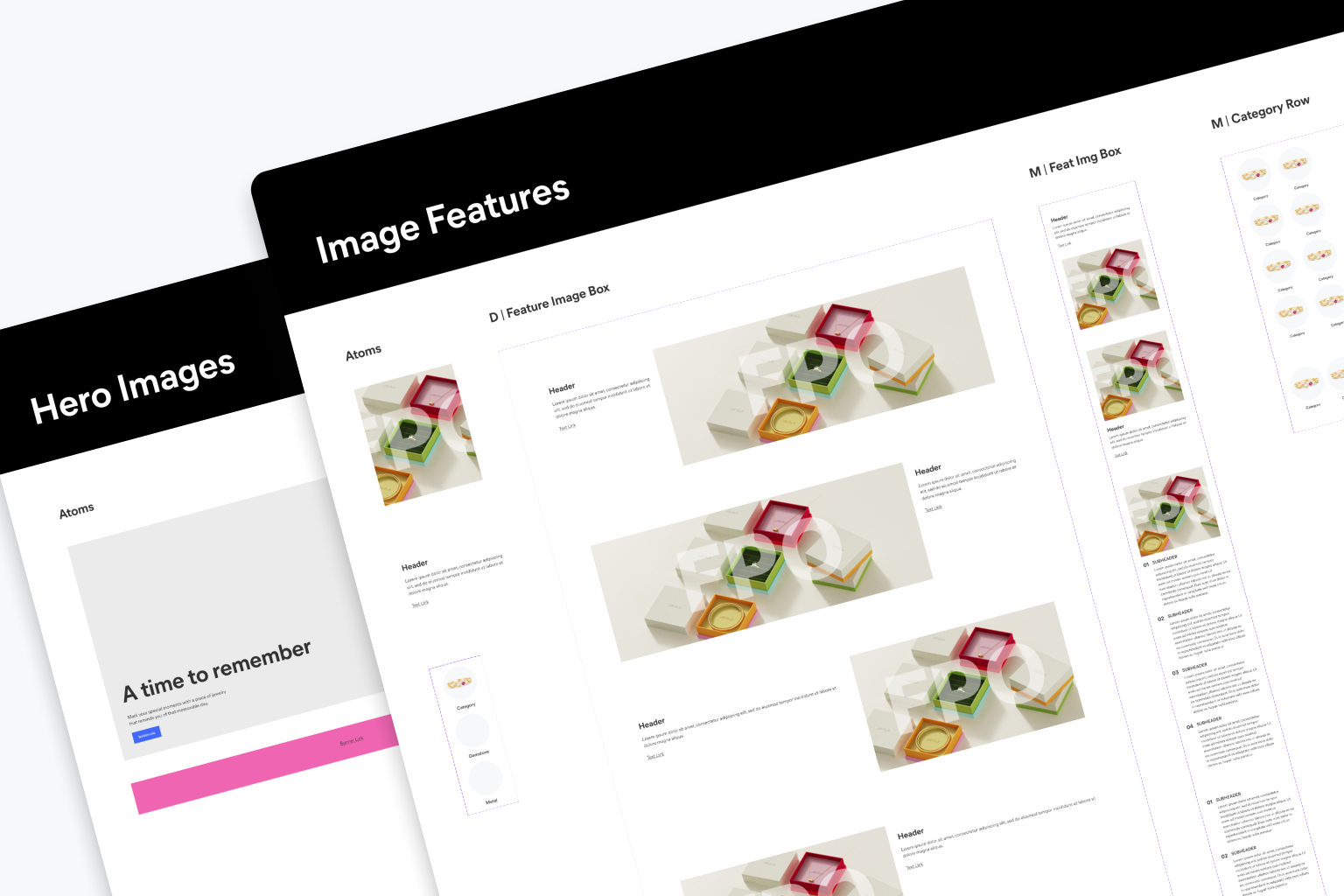
Testing out the typography and content feature components at the various breakpoints and/or devices.
03 | Build
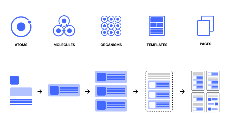
With the foundations established, I started building the component library in Figma. This involved creating net new components, as well as modifying existing components, that scale for the site’s various breakpoints. The entire design system was built using the atomic design methodology for building user interfaces. I started with atoms—the basic building blocks of an interface—and worked my way up to molecules, organisms, etc. This mental model helped craft a scalable and consistent experience, so that every time there was a change, you can modify at the atomic level and ensure the update is carried across the entire system.
Each component included the various states. For example, a button component documented default, hover, focus, pressed, disabled, icon + text and icon-only states.
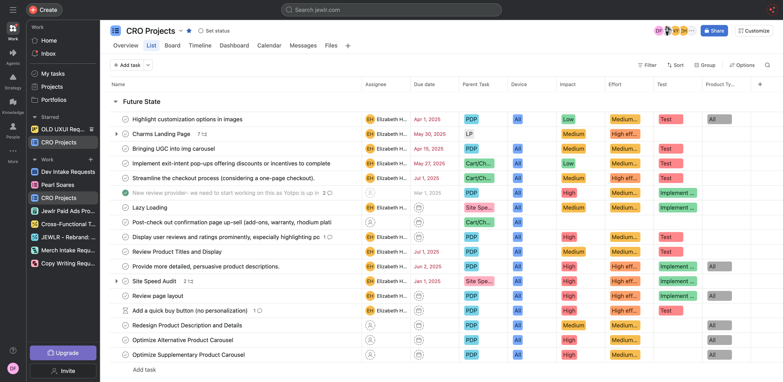
Components were prioritized in Asana by Frequency of Use × User Impact × Implementation Effort.
However, with our peak holiday season around the corner we were forced to pivot. Instead, we prioritized components that were low-lift and wouldn’t necessarily impact conversion. So we decided to start with the content and informational pages in the footer. This helped to minimize the disjointed experience customers would likely encounter in the midst of our brand transition.
We started with fundamental components such as:
Buttons
Inputs
Selects
Checkboxes
Radio buttons
Navigation (header and footer)
Alerts
Modals
Cards
04 | Validate
I worked closely with the development team to ensure the Figma components reflected what could actually be implemented. We established a shared workflow that looked something like:
Design → Review → Development → QA → Documentation
For each component, we reviewed visual consistency, responsive behaviour, interaction states, accessibility and technical feasibility. We were able to test the design system by using it to redesign existing product flows and content pages. This helped to expose any gaps that weren't obvious when looking at the individual components in isolation.
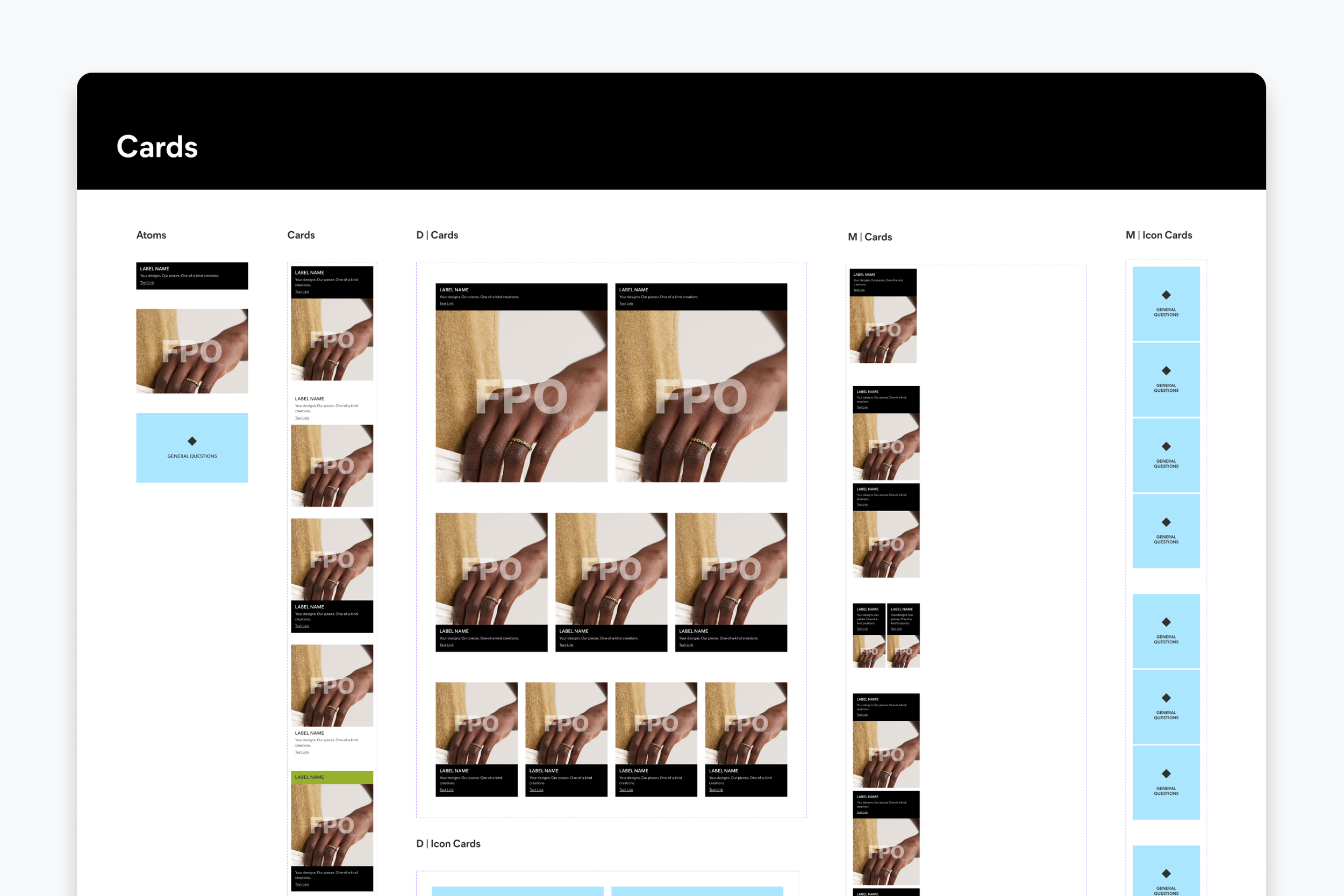
Cards were built with flexibility in mind. Designers can easily toggle various card styles with Figma’s innate variant and property tools. Each card also has the ability to hide or show title, subcopy and text links, along with the option of having the content above or below the image.
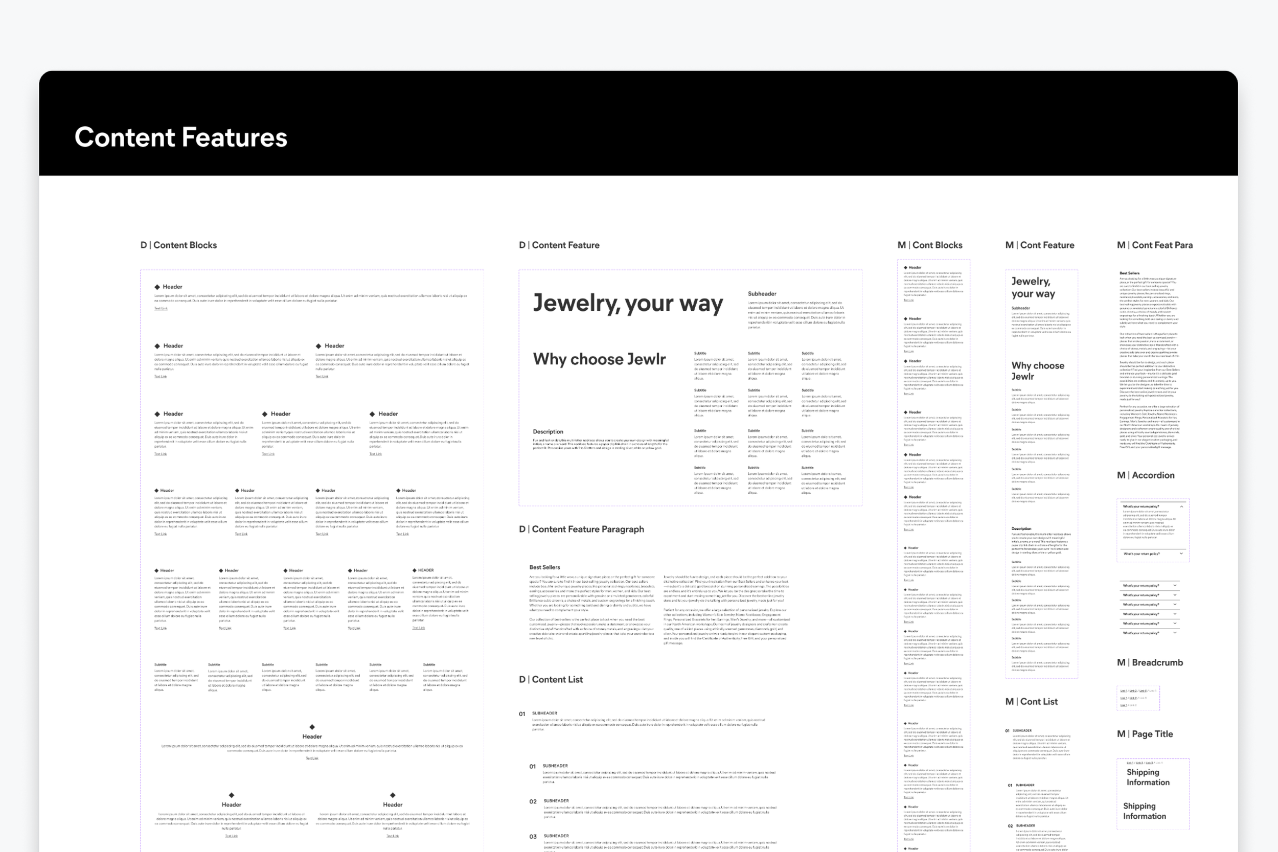
Content blocks are the core foundation of the majority of our copy components. They make up everything from paragraphs all the way to product descriptions and details on our PDP.
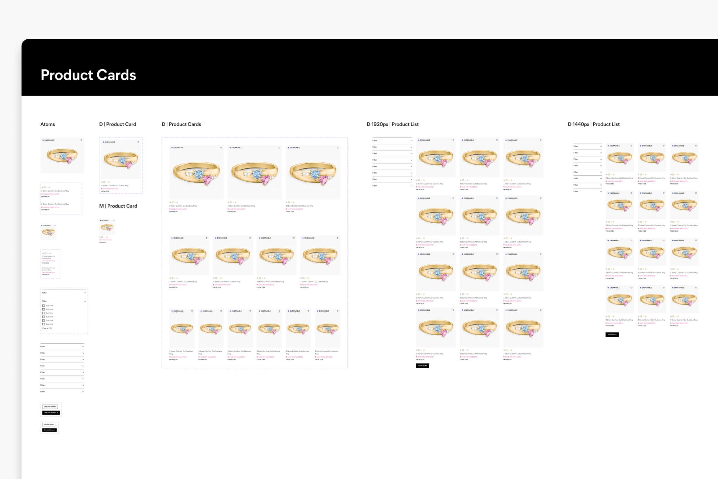
Product cards establish the foundation of all product carousels, the PLP and search results on the website.
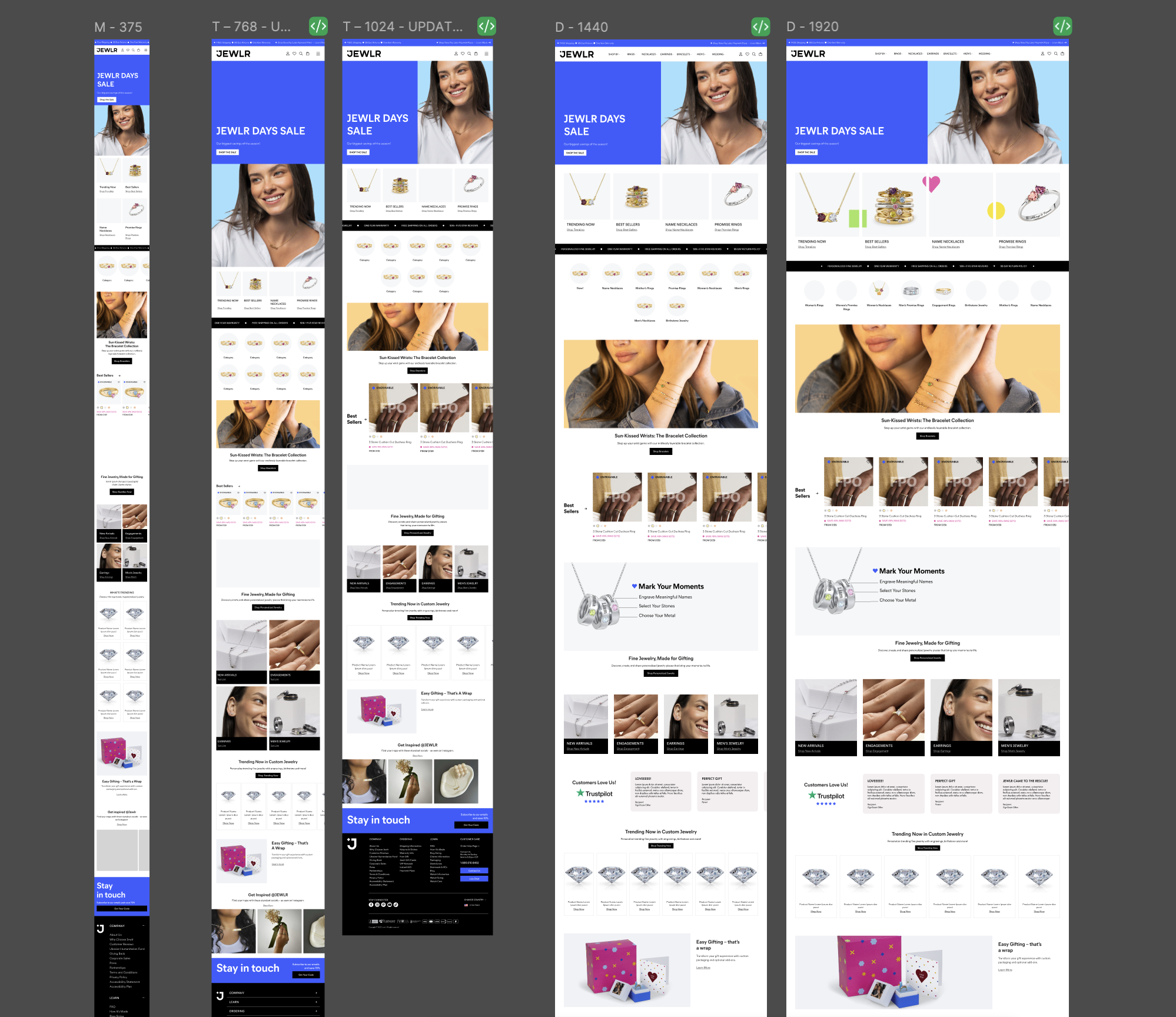
Testing the components on the homepage at the various breakpoints to ensure scalability.
Good things happen when we work together
After five months, we launched a soft version of the design system across the website. It helped create measurable improvements such as:
50% Faster Design Production
Designers could assemble experiences from established patterns and templates instead of recreating foundational elements.
Reduction in Duplicated UI Patterns
Teams across the org reused existing components rather than create new variations.
Improved Consistency
Common interactions, layouts, and visual patterns became more consistent across the brand, including our marketing mailers.
We transformed the design system from a library of reusable components into a shared product foundation. By combining UI auditing, UX research, atomic design principles, and close collaboration with developers, we created a system that helped the team ship and build designs more efficiently.
A design system is a product
It needs users, documentation, governance, maintenance, and continuous iteration.
Design and development work together
Early collaboration and communication with engineering prevented us from designing components that were difficult to implement.
Flexibility matters
A good design system should provide enough structure to create consistency while allowing teams to solve different user problems.