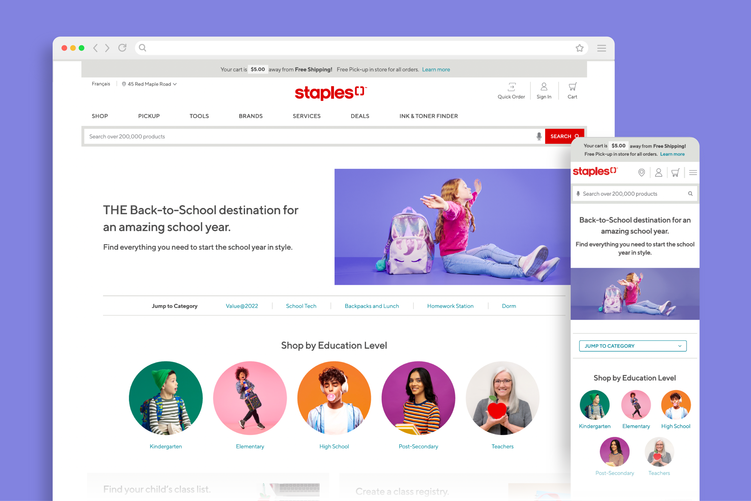
Staples Back to School 2022
My Role
Manager of Product Design
Main Goal
Create a landing page and category pages for the 2022 back to school season.
Back to School is Staples Canada’s largest and most notable seasonal campaign of the year. With value-driven competitors like Amazon and Walmart capitalizing on the market, Staples needed to remain top of mind as a seasoned retailer in back to school shopping. How might we increase sales and engagement with our customers if we can’t compete on price? We use our industry expertise and personalization to our advantage.
Broad not shallow
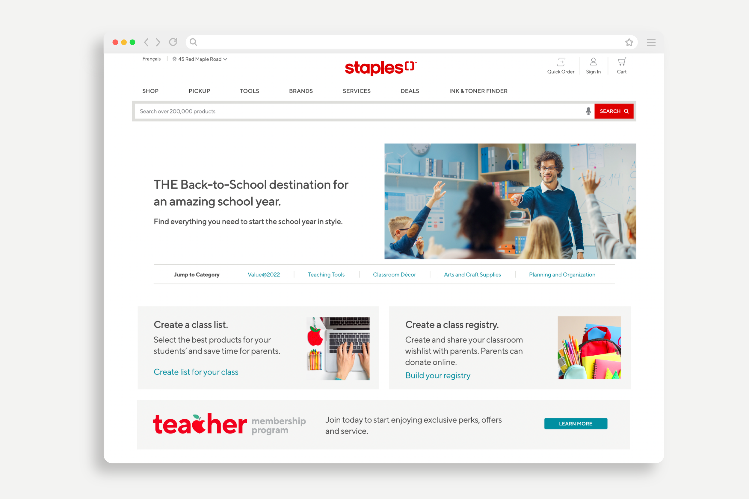
Due to the broad-range in age and job functions, the digital pages must serve the needs of parents, students and teachers alike. Some users like to browse and explore options not necessarily sure of what they’re in search of. Whereas others know exactly what they’re looking for in hopes of knocking yet another item off their shopping list. How might we personalize the back-to-school shopping journey so that it caters to all users but still delivers an individualized experience? With specialized category pages.
Each year, parents and students get ready to take on the new academic year that lies ahead. This fresh start is synonymous with the purchase of new school supplies, tech, clothes, backpacks and accessories. It’s a time to rock new swag that shows off each student’s style and personality. The back-to-school shopping season peaks in the month of August with some shopping as early as the beginning of July. The latter tend to be teachers preparing their class lists at the end of the previous academic year.
What users want
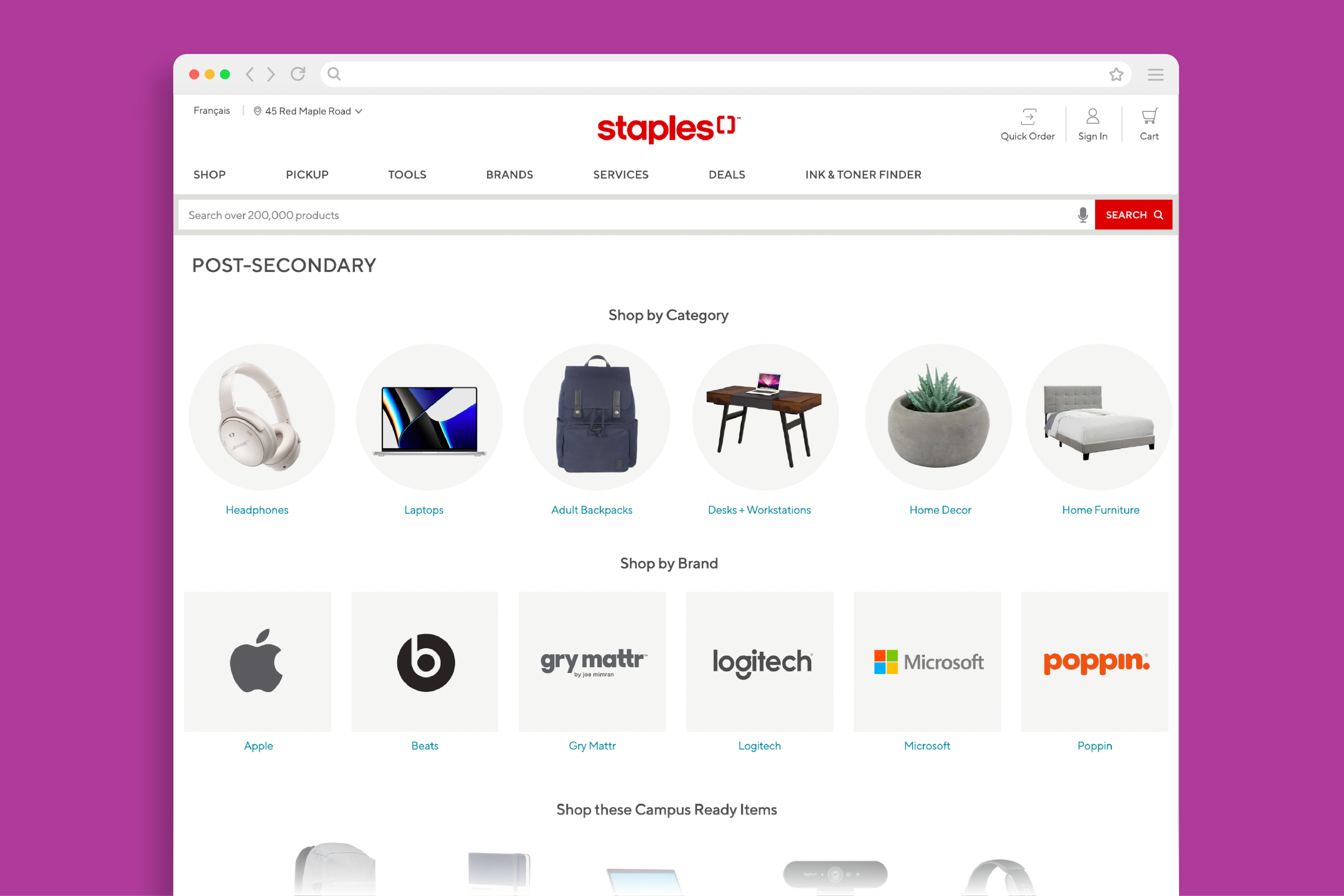
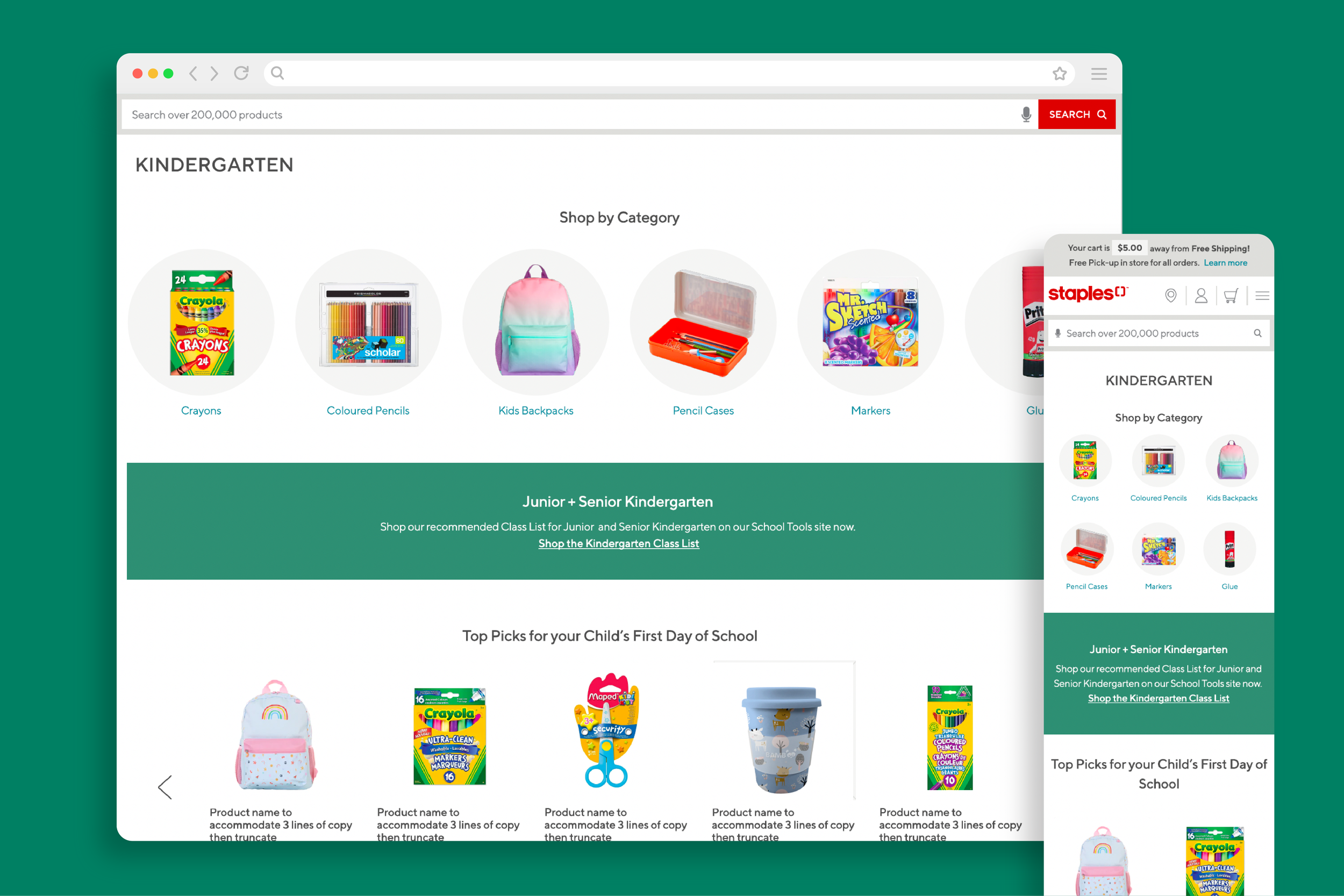
We also conducted a competitor analysis to see how we fare against other retailers in the back-to-school space. They too had prioritized subcategories as the primary content of their pages. So we introduced “Shop by Grade” category pages full of content and products that catered to the corresponding age group. This would make it easy for parents and students to browse age appropriate items or find exactly what they came to find. It was also the perfect opportunity to review our established design patterns for anchor links and subcategories, and revise them to be more aligned with user expectations.
The Staples UX team took a deep dive into category pages and uncovered that there was a lot of room for improvement. Our category pages currently served the needs of only one type of user; the kind that is expected to sort through pages upon pages of product listings and use filters to narrow down the results. But what about the kind of users that were seeking inspiration or looking for a starting point? In our analysis we uncovered that category pages are an excellent opportunity to promote subcategory navigation and encourage users to be more intentional about their path selection before displaying hundreds of products.

Omni-channel experience
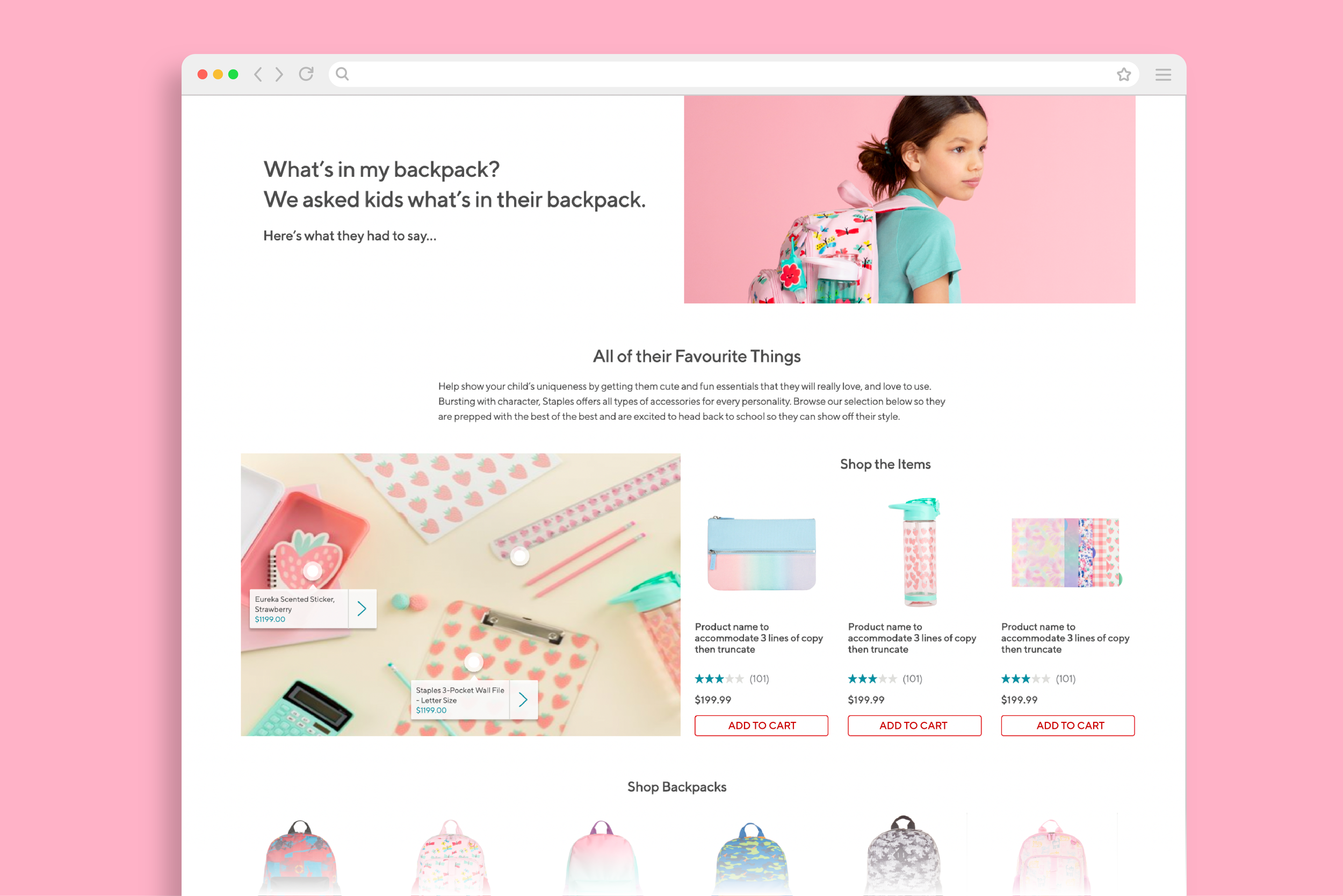
We worked closely with the marketing team to capture a true omni-channel experience for this year’s back to school season. Regardless of whether you shopped online, in-store or browsed our printed flyers, customers could expect a seamless transition in imagery, signage, voice and tone. Parents could shop teacher’s or Staples’ curated class lists online or in-store via the School Tools program. And back-to-school related blogs across the site directly referenced and linked to product making it that much more convenient for shoppers to shop recommendations.
Set up for success
Advocating for the addition of the “Shop by Grade” category pages and prioritizing the needs of our customers proved to be successful. The categories turned out to be one of the highest performing pages as we saw a significant increase in engagement. They made up 47% of the campaign’s user interaction alone and a revenue of $16.9K. Moreover, the success of these pages sparked ongoing conversation, improved stakeholder relationships, and rallied early support from our marketing partners for the 2023 Back-to-School season.
Breaking down silos
When we collaborate and all work towards one common goal amazing things happen.
Don’t reinvent the wheel
Stick with UI patterns that users are already familiar with.
User-centred design
We can drive measurable impact when we put the user first and at the centre of everything we do.